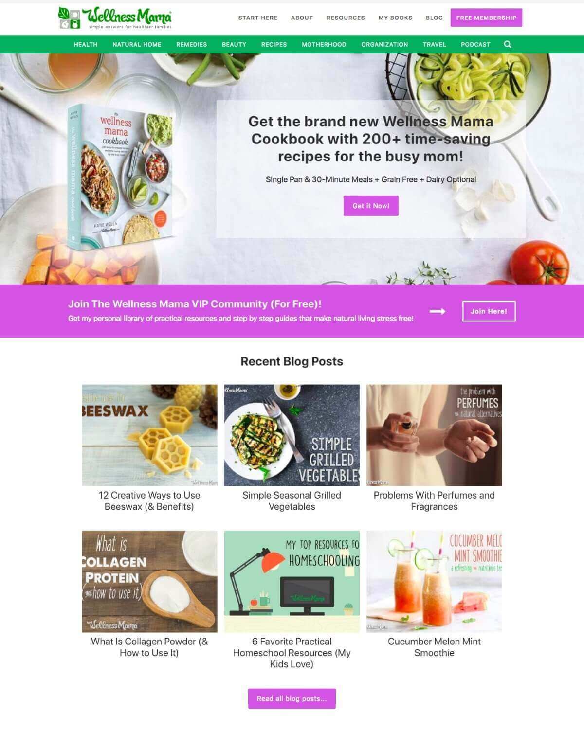
You may have noticed that WellnessMama.com recently got a slight website redesign this past week. I seriously dislike updating and redesigning, as the process always takes longer, costs more, and is even more mentally exhausting than expected. One of the things I’ve learned since 2006 (when I first started blogging) is that I’d almost rather go through labor then redesign the blog, but sometimes it’s a necessity. And this redesign was no exception. It’s been in the works for over a year!
Although I liked the old design, I decided to make a few changes that I think will provide a better user experience for you. Here are some of those changes:
Updated Resources Page
For years we’ve had a resources page listing all my favorite companies, products, ingredients, courses, and other resources that I personally use and recommend to family and friends. It’s always been a reader favorite since you can find all the products I recommend in one easy location. But over time it got a little unwieldy and wasn’t organized nearly well enough for a good user experience. With the new and improved resources page, it’s much much easier to sort and search through all the recommendations, so you can always find what you’re looking for. This is still a work in progress and will continue to get updated over the next few weeks, but you can check out the new design and functionality here.
Medical Review Board
Over the past year we’ve been putting together a medical review board of doctors, researchers, and expert advisers to review all the articles on Wellness Mama and ensure the information presented is up-to-date, balanced, and backed by science. It’s always been my goal to take complex topics and break them down into easy-to-understand articles that will improve the quality of your family’s life. By utilizing known experts to quality check my work, you can rest assured that what you’re reading is factually accurate and trustworthy. Each article that has been medically reviewed will list the reviewer’s name next to the post author, which you can click on to learn more about him or her and see the other articles they have contributed to. You can learn more about our medical review board here.
No Sidebar
In the past, when reading a blog post on your computer, there was a right-hand sidebar that linked to other posts, social media, a search box, recent podcasts, and recommended resources. While some readers found it helpful, I do want the focus of the blog to be on the articles and information provided instead of distracting asides. Because of that, we’ve removed the sidebar and some of the ads so you can focus on the content… which is why you’re here in the first place, right?
Improved Mobile Experience
The majority of Wellness Mama readers visit on a mobile device, so ensuring that the website loads fast and is easy to use on a phone, tablet, or any other device is of the utmost importance. We’ve simplified the design and removed some of the distractions and slow loading components so the site should load much faster and be easier to read as well.
Along with the obvious design changes, there were a lot of behind-the-scenes coding changes that I don’t fully understand which help the site work better and faster.
Thanks to the amazing tech teams at WP Engine, Powder Design, and Spears Marketing, this transition went relatively smoothly, even though we still have a few more tweaks and updates to make over the next few weeks.
Wellness Mama Design Time Capsule
As we finished the recent updates, I looked through all of the past designs I’ve had over the years (since 2006). Each one has definitely been an improvement over the last. If you’ve been a long-time reader, how many of these designs do you remember?
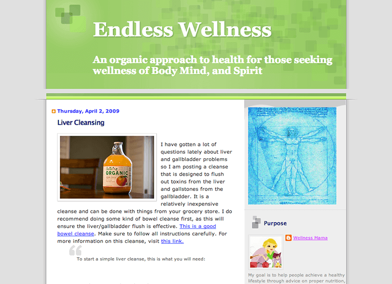
My original site on blogspot.com:
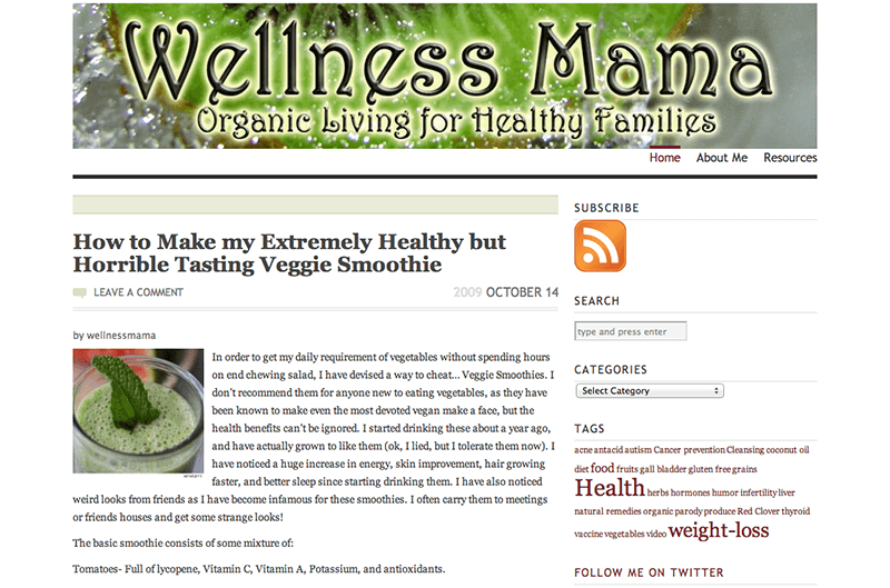
First WordPress.com design:
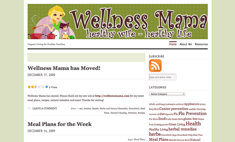
Second WordPress.com design:
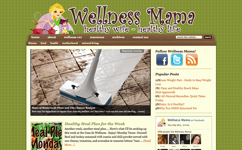
Second self-hosted WordPress design. I didn’t keep a screenshot of the first one, but I did it myself and rest assured, it was pretty bad! 298 people liked me on Facebook back in 2010 and I remember each of them by name. Many of them still comment pretty regularly and I feel like we’ve become e-friends since then.
And then there was the pink theme with the cartoon me 🙂
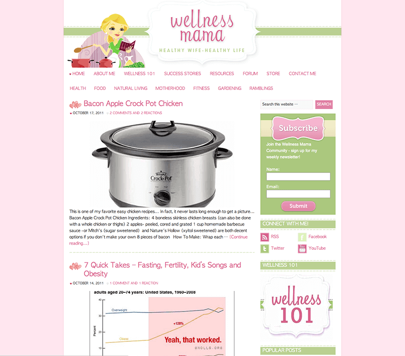
And my first mobile-friendly design with custom hand-drawn typeface logo:
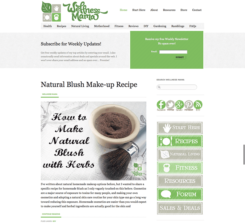
My first truly custom blog design, with the updated logo that I’ve used for years:
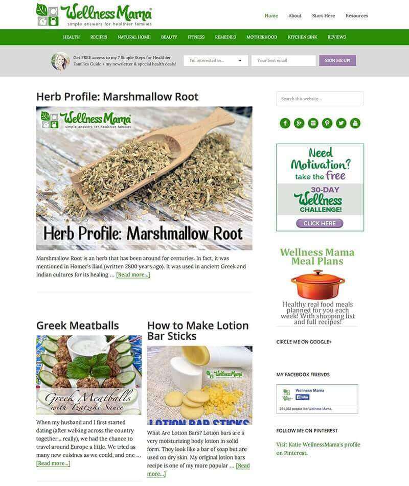
This was an updated version of the above, but with a more personal touch on the homepage:
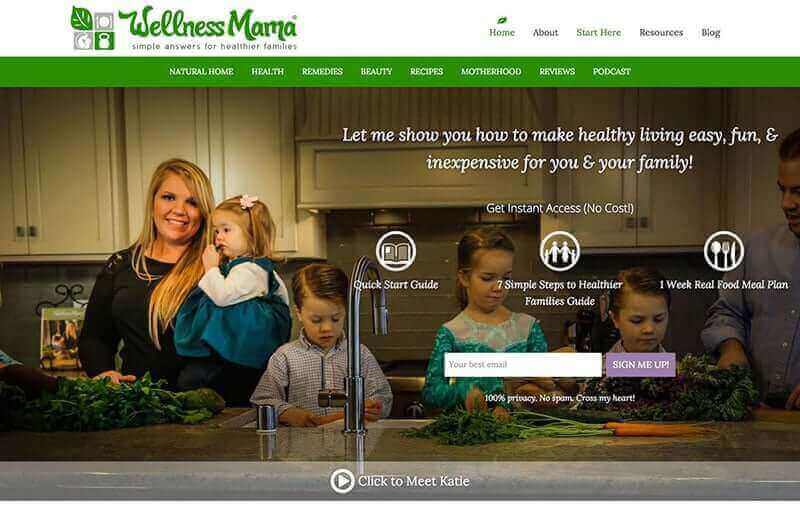
An improved version of the above, with the old membership site:
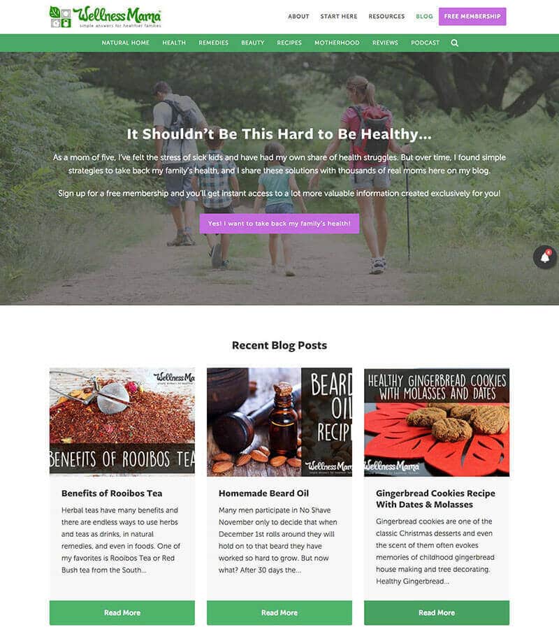
And this one that we’ve had for several years that announced my new books:
Blogging Tips?
I get asked for my blogging tips pretty often, and to be honest, I don’t feel qualified to answer most of the time. My goal when I started blogging was to help other moms provide a natural and healthy lifestyle for their families so they can improve their health and happiness.
I’ve learned a lot over the years about formatting blog posts and using social media, but at the end of the day, my best tip (as corny as it may sound) is to make sure that the focus is always on helping others. If you truly care about your readers, authenticity will show through in your writing and others will be attracted to it.
My Blogging Resources
This is a list of the blogging resources that I use for my site in case they can be helpful to any of you who blog or are thinking of starting a blog (go for it!):
- Domain name registration: Hover
- Website hosting: WP Engine
- WordPress theme: Powder
- WordPress training tutorials: WordPress 101
- Website security & backups: Sucuri
- Form creation software: Gravity Forms
- Recipe creation: WP Recipe Maker
- Email newsletter: Convert Kit
What do you think? Do you like the new design changes? Anything you’d do differently or still has bugs that need be fixed?

Leave a Reply